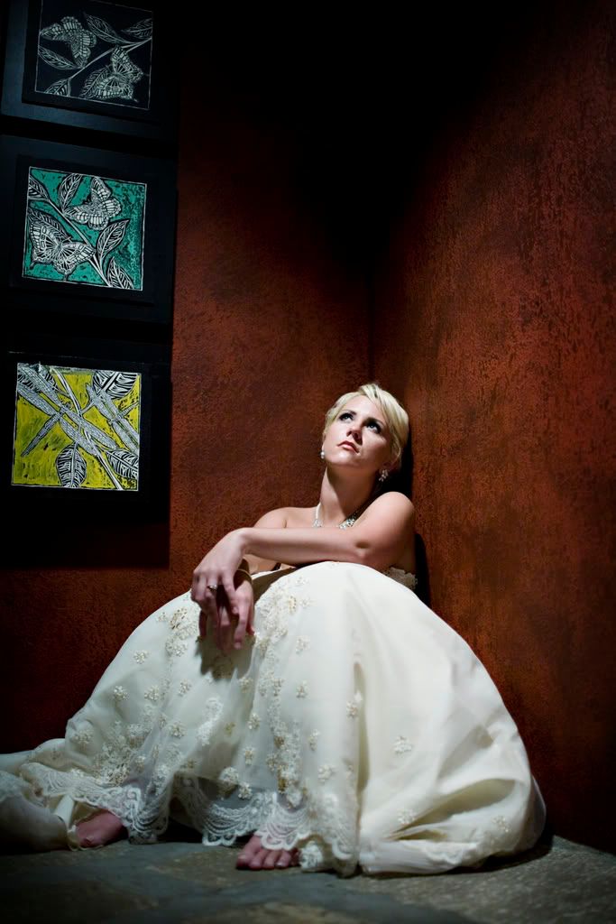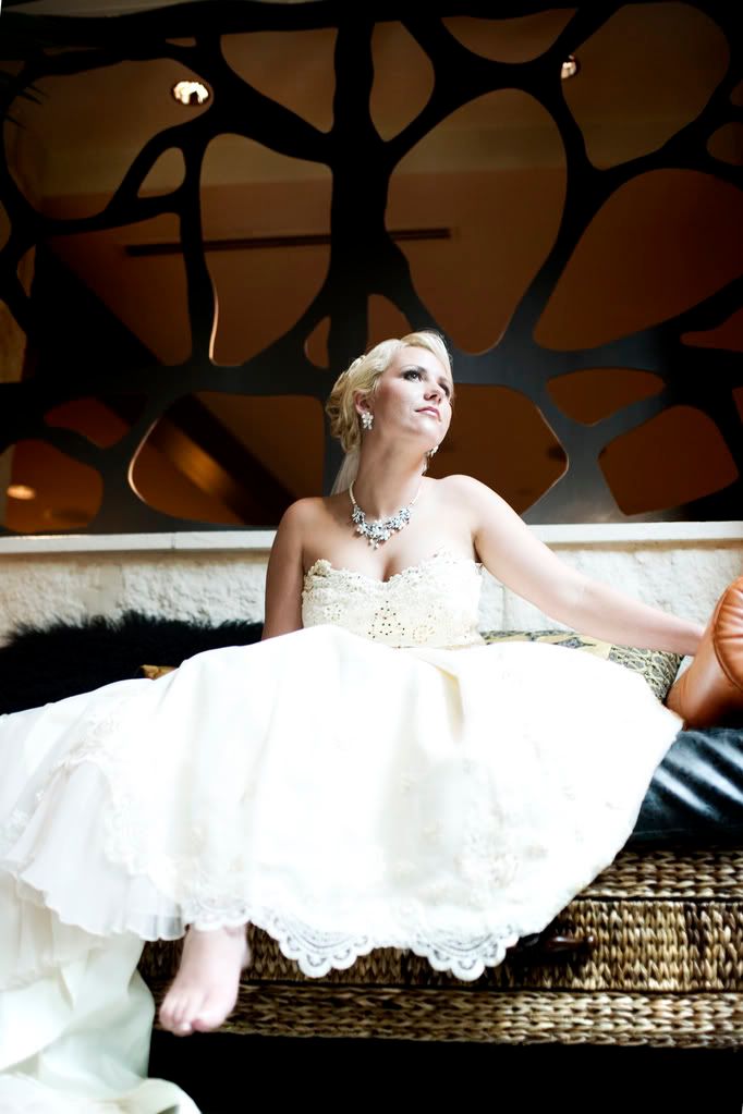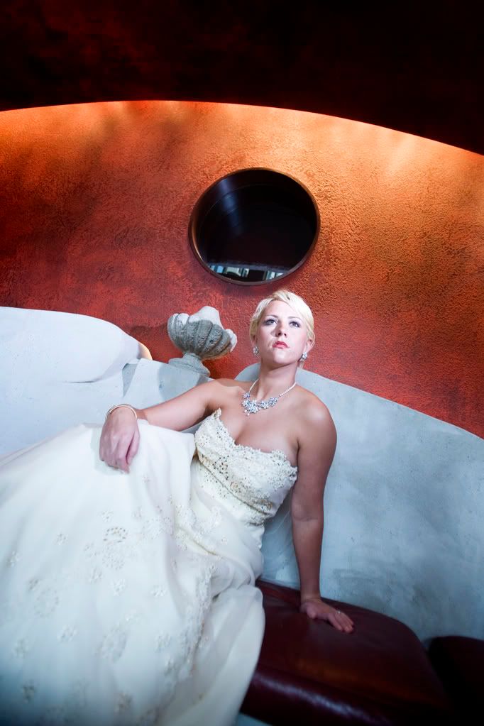


Help us choose which picture should go on our new ad. We know we want just one image (since our other ad. has several). We have narrowed it down to four, but we just can't decide. The first two are pretty similar.
Leave us a comment...tell us what you think!
22 Comments:
I like the second one...nice job girls. =)
I like the first one.
#2 followed closely by #3. All beautiful!
OOH, these are beauties! I can see why the decision is so tough! Depending on the size of the ad, I'd go for #2 or #1. If it's a fairly large spread, I like the negative space in #2. BUT, if it's on the smaller side, I think that the detail you can see in #1 would be best. Y'all are awesome! :)
I agree with Stacy - #2 followed by #3. Beautiful images ladies!!!
Lovin' #2 and #3. Love that natural light pouring in on the 3rd one, but I like the model's pose/expression on #2. Either one would work great!
LOVE #2! Awesome y'all!
Hi girls! #1 is my favorite! Beautiful photos!!!
I like #2. They're all GORGEOUS! :)
#2
I love all of them but I choose #3!!!!!
#2 or #3 All are great, as usual!
#2. They are all wonderful, and the lighting is great but something about the bare feet shows personality.
all beautiful!! i pick # 3 because the bride looks happy pondering her wedding day.
These are exquisite. #3 is my choice, I love the background. Sure wish all could see the pic of Caroline I just got. Traci you play well at home.
I think #2 is best considering the lighting of all those you posted.
Keep up the great work girls!
I say the second or third! By the way...hope you are doing well! We should talk more!!!
This comment has been removed by the author.
Kellie and Tracy,
We love all of them. Dad chooses #1 because he loves the "subject matter"! I choose # 2 then #3. I love the bare feet and non traditional pose. Of course I have to say the dress is beautiful considering I wore it 25 years ago! You two ladies do a fabulouse job! We have so enjoyed looking at the wedding photos!
Having a beautiful bride always helps the pictures look great! Number 1 is my favorite - the camera angle has her looking up, the detail and lighting and shading is awesome - great photo - as are all the others.
This comment has been removed by the author.
As the Bride...I love #3, it makes me feel like a princess all over again. The two of you are so talented and I am honored to be chosen to be apart of your advertisements.
Post a Comment
Subscribe to Post Comments [Atom]
<< Home